
I’m a product designer and front-end developer living and working in San Francisco. I love design systems, writing code, red pandas, karaoke, purple, and learning new things.
I’ve designed for programmers, social change, finance, and karaoke.
Sometimes people call me Chelsea.
You can find me on Twitter, Dribbble, GitHub, LinkedIn, Medium.
The following is a curated collection of projects I'm most proud of. For my full resume and work history, see my LinkedIn.
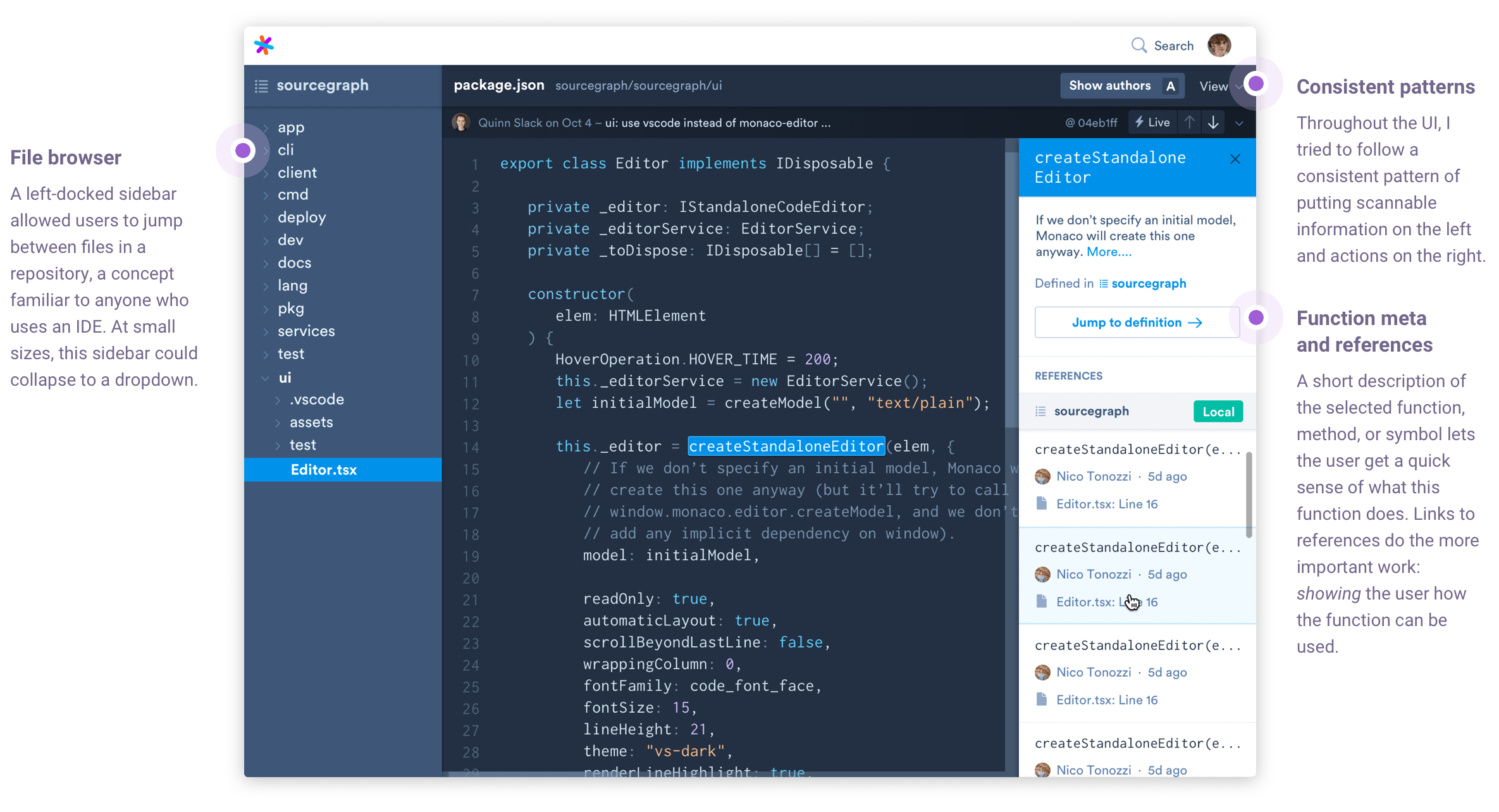
Sourcegraph's goal is to make programmers more efficient by making code easier to browse and understand. During a product sprint and under the direction of our Director of Product, I designed and helped implement a code view that attempts to answer two key questions: What does this code do and how should I use it?
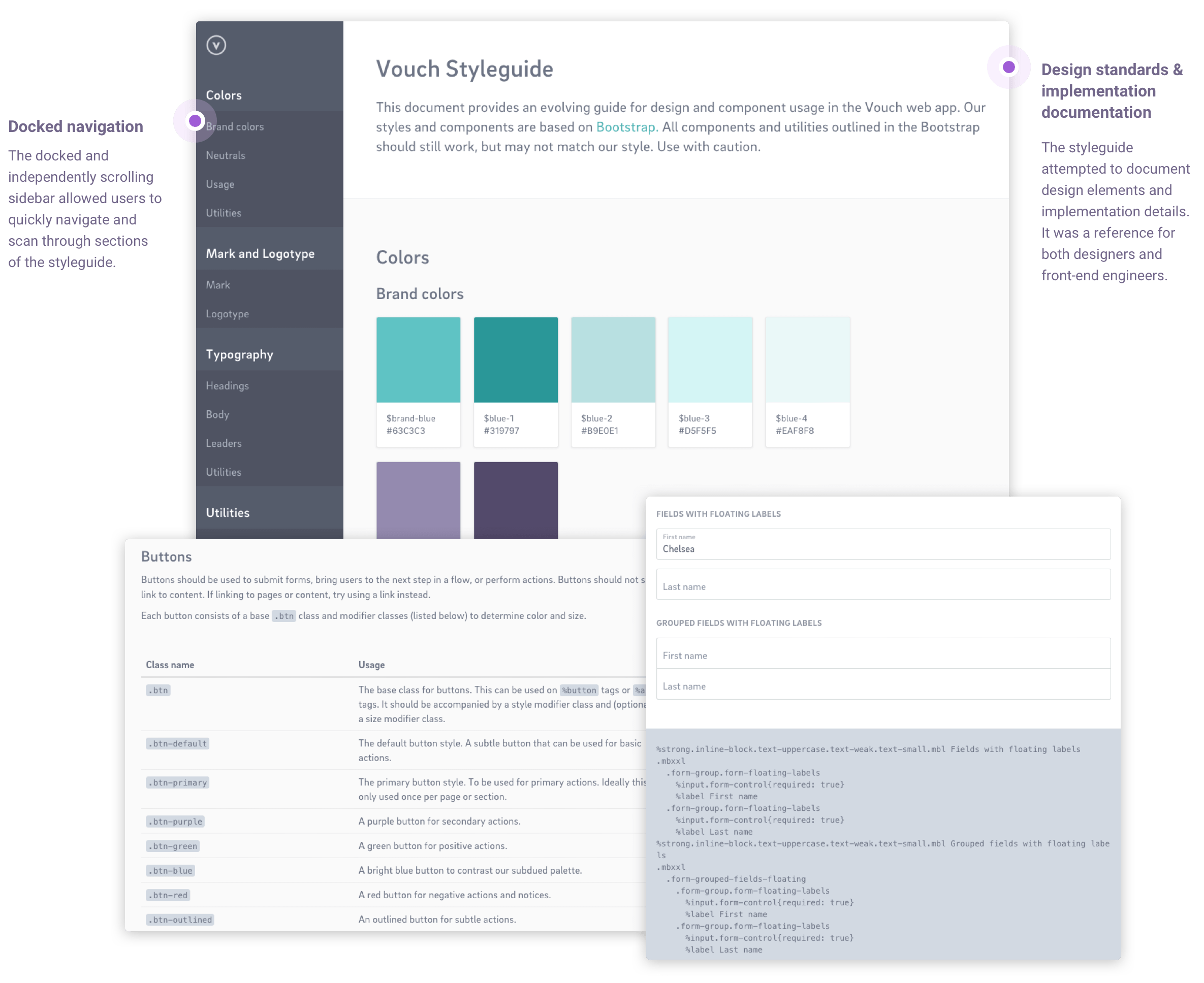
As we began building our product, it became clear to me that we needed to implement and document a set of guidelines to keep the product consistent while keeping the development process light and fast. I built this styleguide as a way to communicate and enforce the idea that we're not just designing features — we're building a system.
In Vouch's early days, the application and approval process for a loan was complex and unruly. We needed a method to plan our shift from manual processes to a fully-fledged product.
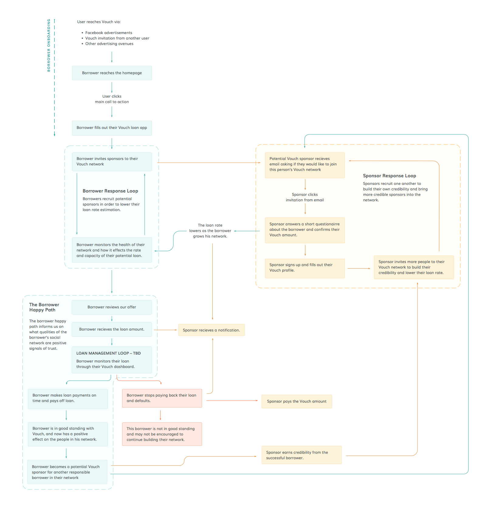
This visualization focused on identifying the main user flows and reward loops we wanted to create to promote viral growth. Ideally, happy sponsors and borrowers would recognize Vouch as valuable method for getting affordable credit and grow their own personal networks, exposing Vouch to an ever increasing number of customers.
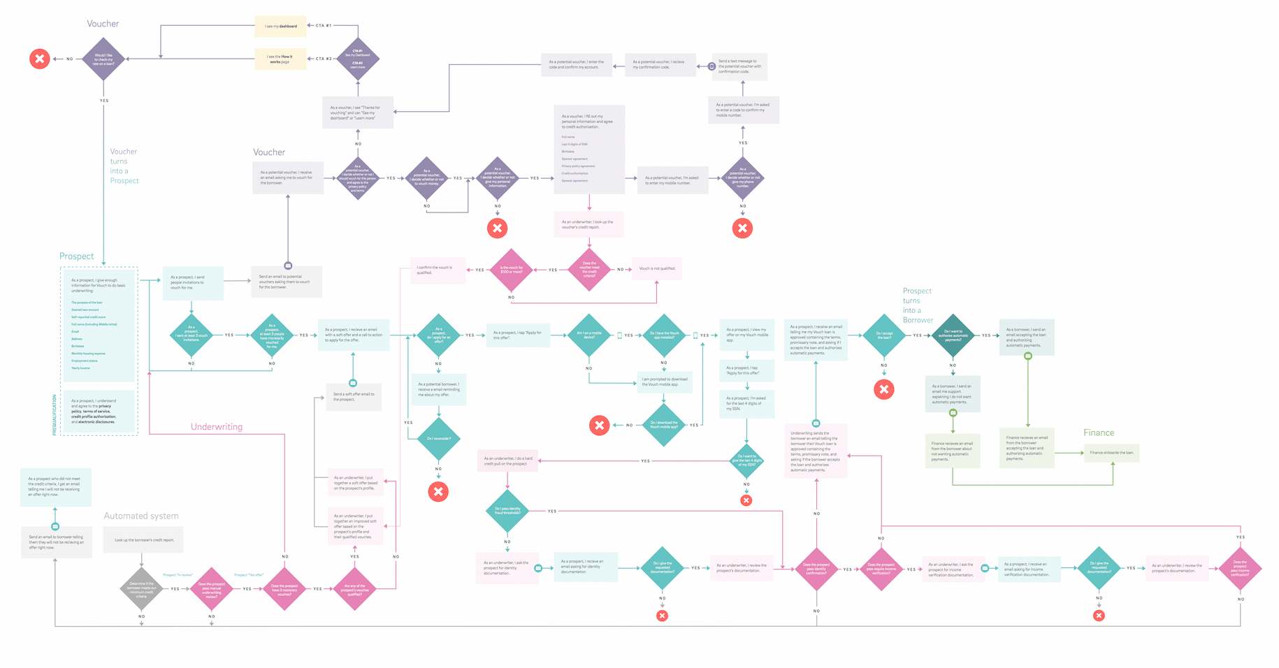
This more complex flow shows the interaction between different customers in the Vouch ecosystem: prospects, borrowers, sponsors, and internal staff. We used this as a tool to prioritize features, educate new employees, and solve design problems. A full size version is not available. If you'd like to see it, please contact me.
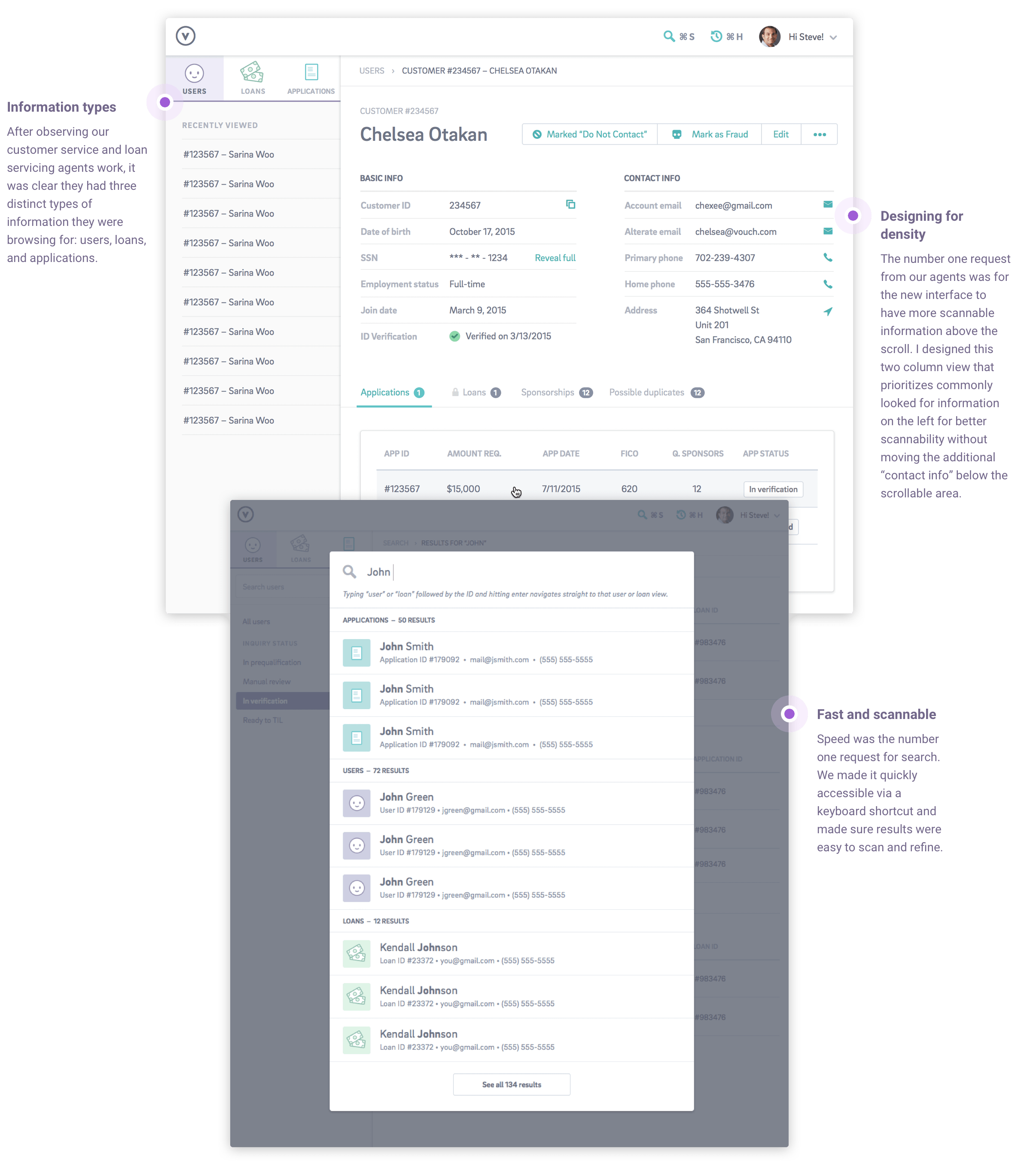
Our finance, customer service, and verification teams are the backbone of our business. They provide valuable insight to our customer's everyday lives. The first versions of the tools we built for them were ad-hoc and thrown together without much thought to design or user experience. I wanted bring a new standard to internal tools — an area often neglected by design.
I implemented many of these features using React and ES2015 via BabelJS.
Vouch's desktop and mobile web experience is the main point of entry for the majority of our prospects. We discovered early on that until a borrower has an active loan, a native application doesn't provide much value to them. While we initially planned on mobile usage being a native experience, we soon realized it would be more valuable to focus on a responsive web experience.
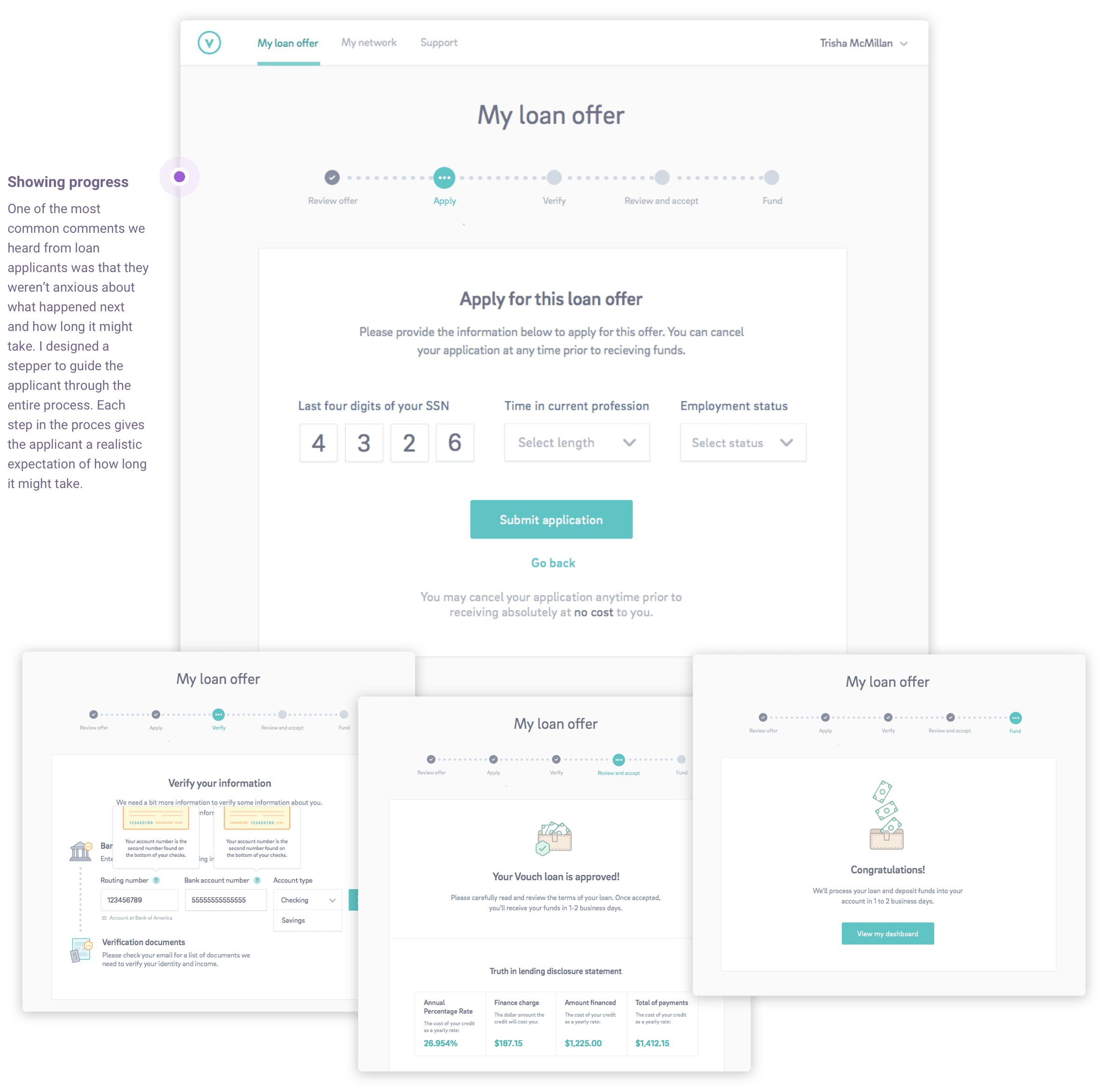
This series of screens brought a user from applying for their loan all the way to a funded loan. I worked closely with legal and finance to create a usable, web-friendly version of a promissory note — a document with strictly regulated standards that most lenders deliver as a PDF or piece of paper.
Vouch’s first iOS app focused on the prospect flow — bringing in prospective borrowers and providing them a quick path to checking their rate and growing their network. Customers who used the iOS app were much more likely to grow their networks.
We soon discovered that, while a native iOS app could provide a better social experience, customers seeking loans didn't want to go through the hastle of downloading an app just to check their rate.
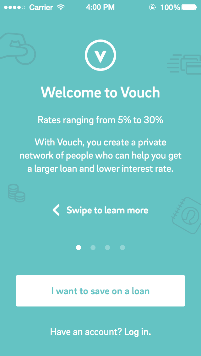
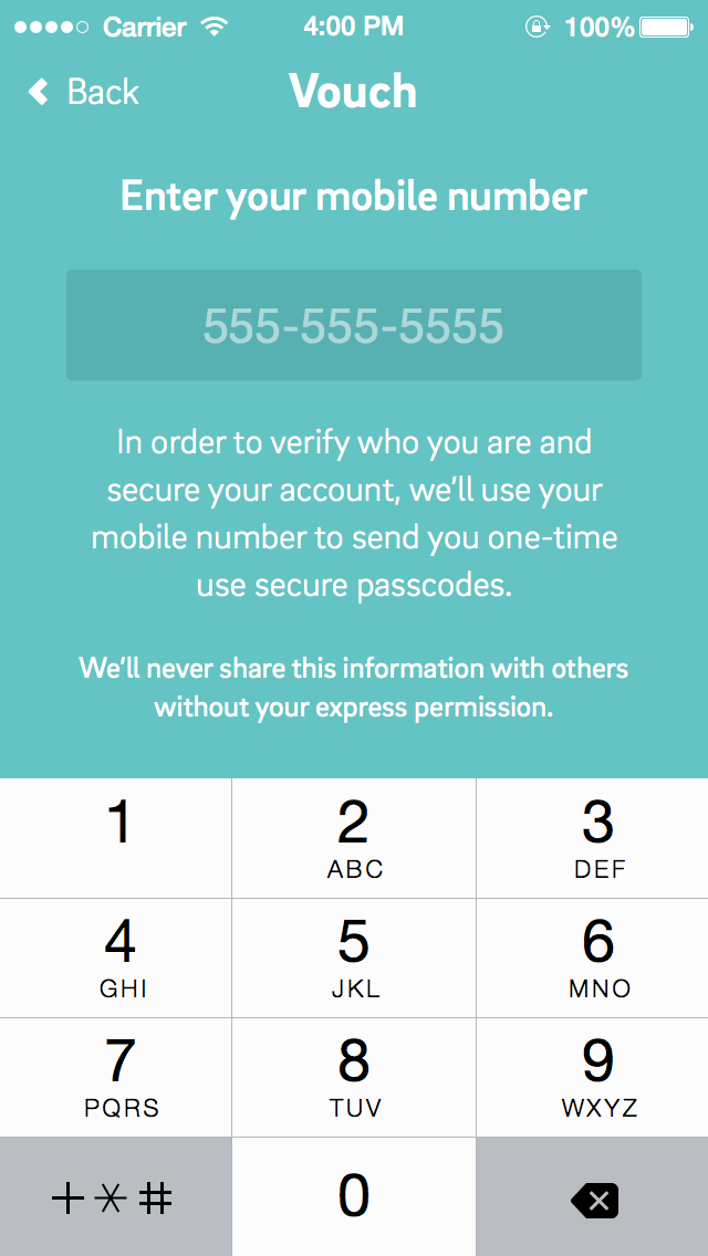
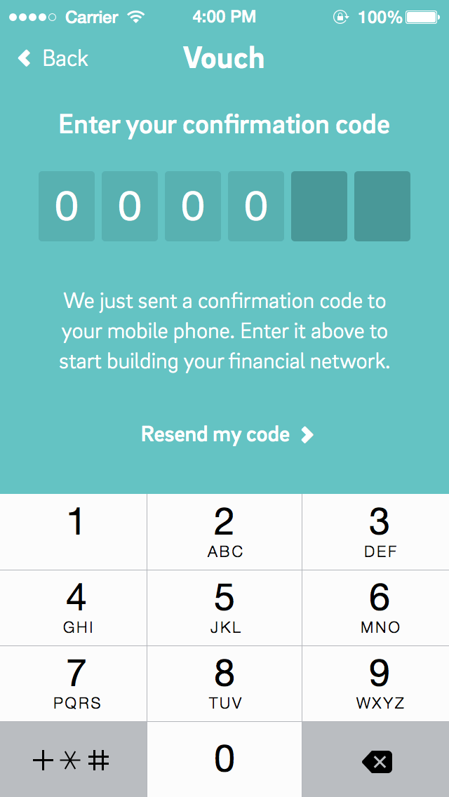
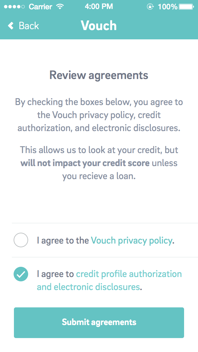
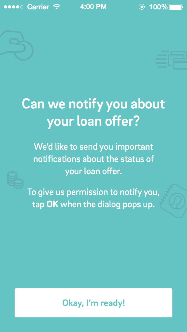
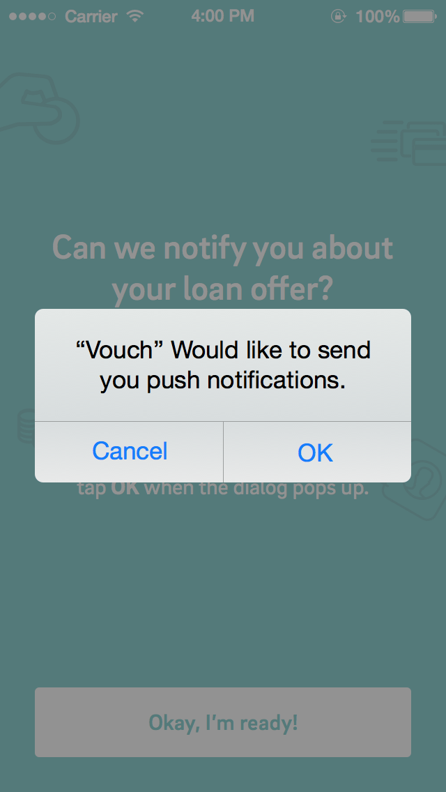
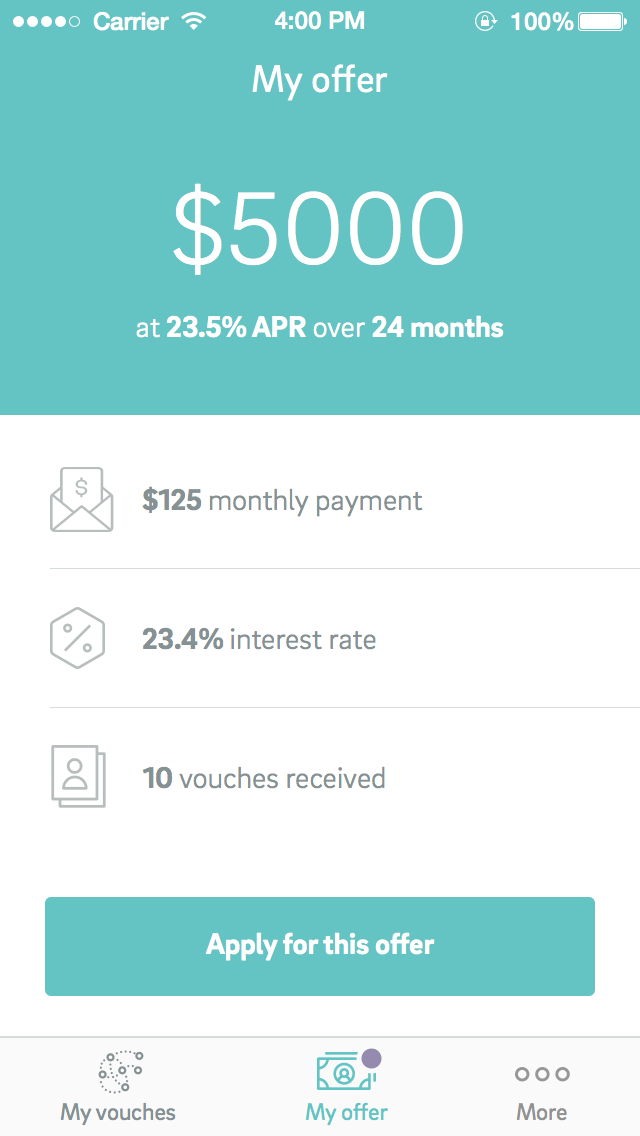
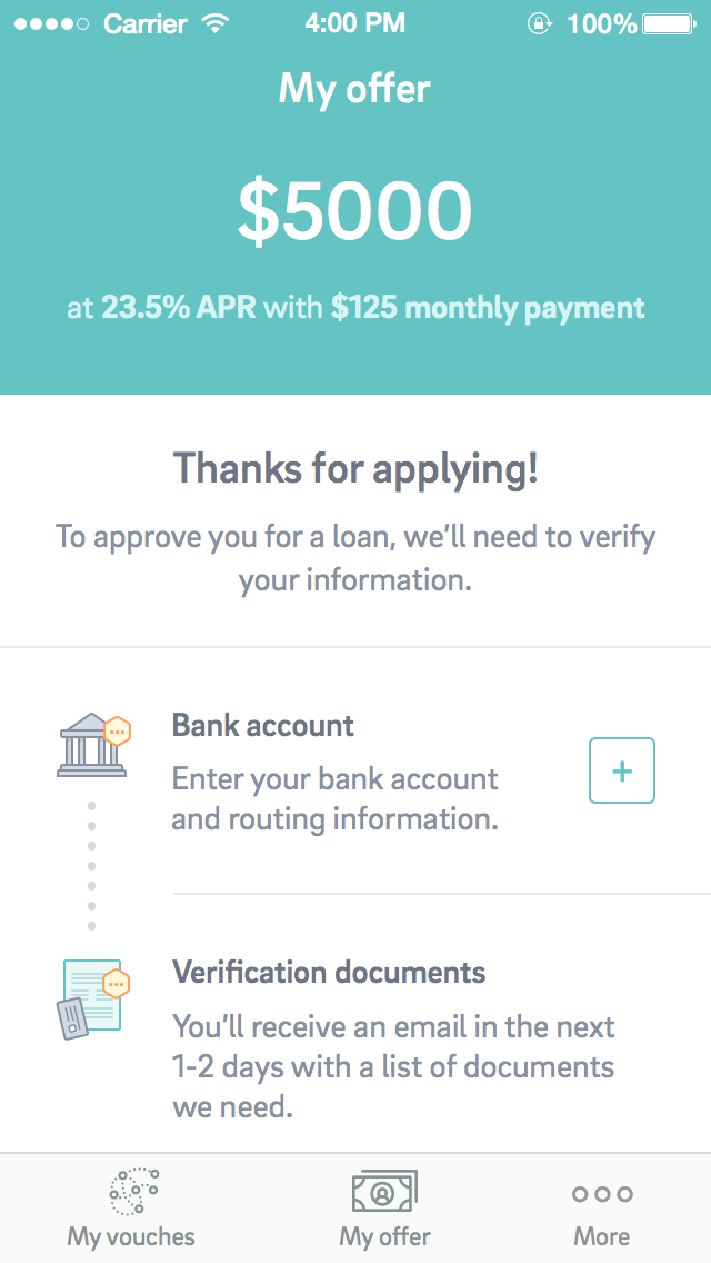
A few key screens from the prospect flow of the iOS app. This flow focused on bringing a prospect through sign up and loan application flow while encouraging customers to enable push notifications.
Soon after I joined TaskRabbit, our team was tasked with building a cross-platform product to focus on and streamline deliveries through the TaskRabbit platform. I designed and directed a mobile-first responsive customer experience for deliveries and managed the project to launch.

User flow depicting both desktop and mobile designs for major steps of the customer experience. (See full size)
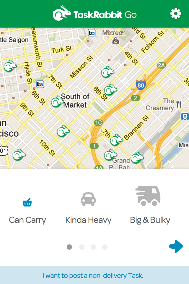
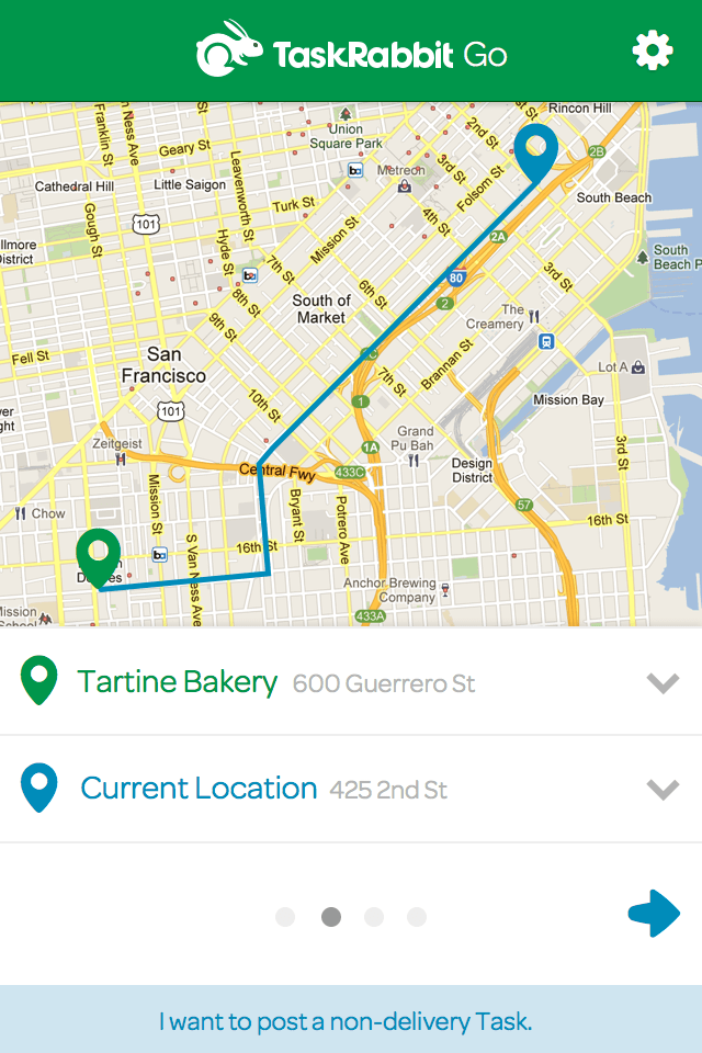
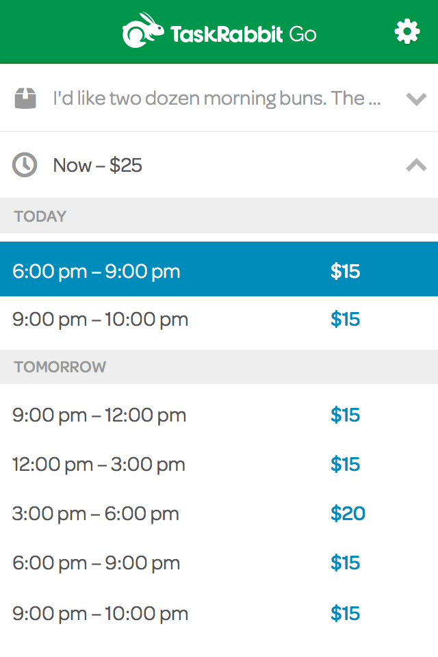
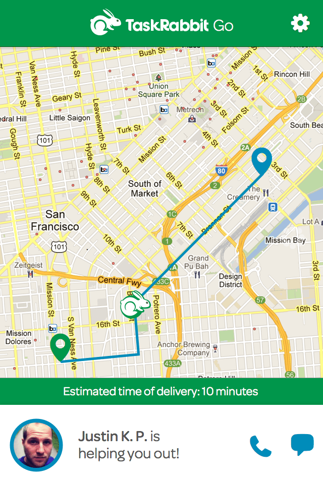
Some sample screens from the mobile web version of TaskRabbit Deliveries (previously TaskRabbit Go). A customer can request a delivery, choose a price and timeslot, and then track their delivery as it's on it's way.
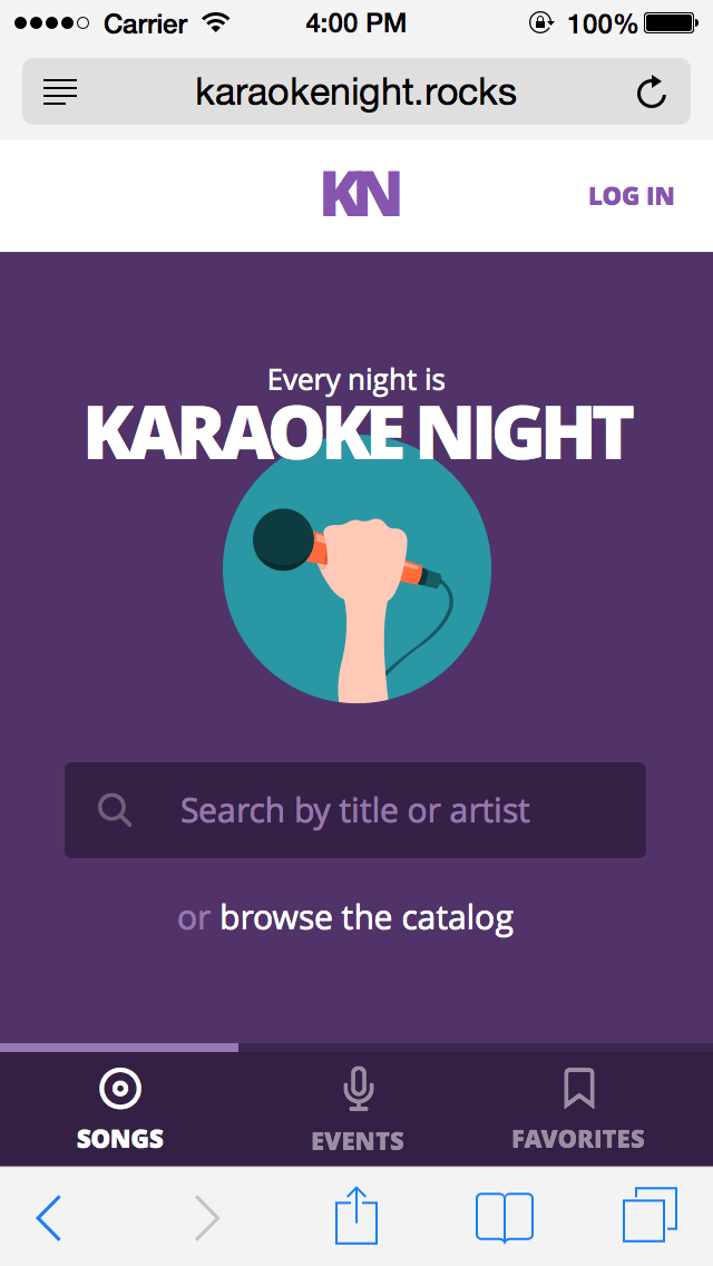
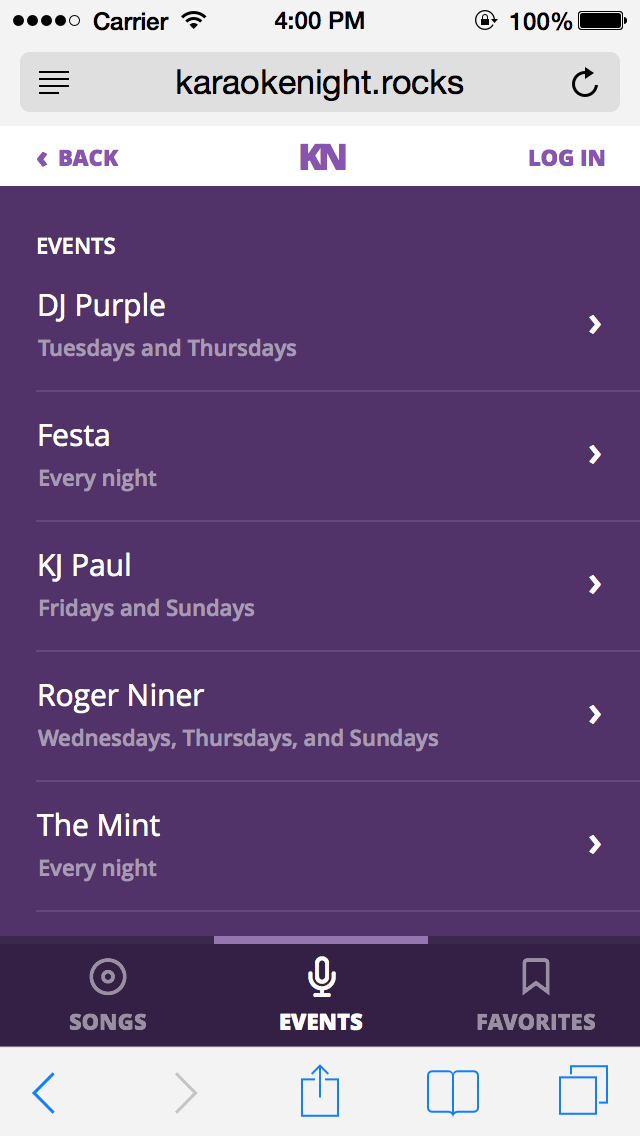
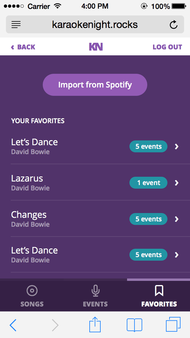
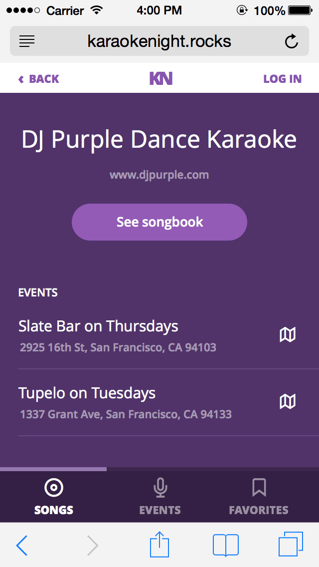
KaraokeNight is a mobile web app that helps you build a karaoke repertoire and match the songs you want to sing against Karaoke songbooks near you. As an avid karaoke enthusiast, I'm always trying to find new songs and new places to sing — so when prompted to build a project as the capstone to Bloc.io's front-end development course, Karoke Night seemed like just the thing.
This project is currently on hold.
Here are a few things I've written and spoken about: